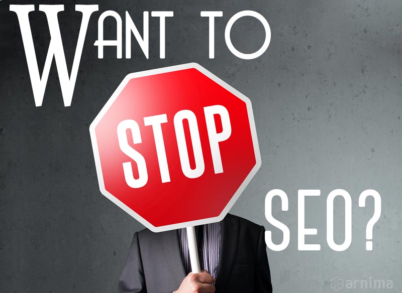
Don’t Stop SEO on Your Website Before You Read This

Read This Article Before You Stop SEO on your Website

For a lot of marketing and operations executives or financial controllers, it is normal to start questioning the recurring expense of SEO, especially if it has gone on for what may be perceived to be an extended duration.

Should you stop SEO efforts on your website? It is actually a bit of a difficult question to answer.

If you ask around, you will get different answers.

Most SEO pros might say “never”. Some may say “it depends”. Very few will say “aah, sure, but make sure you really think about it”.

It actually depends on several key factors.

Let’s take a moment to look at each factor and its possible consequences before you make any decisions about your stopping SEO campaign.

Search Engine Updates

Search engine algorithms are continually changing and evolving as search engines work to provide what they call “the most credible experience” for their users.

(What they mean by “credible experience” is that the search engines want to return the most relevant and real results for their users.)

Here is a video posted on Google’s YouTube channel. The video is from back in 2011, but it is still relevant.

You will see that Google made over 500 changes & adjustments (Google calls it improvements) to its ranking algorithms (the magical code-behind-the-scenes-that-determines-rank) in that year alone. That is almost 2 updates every single day! And these updates continue, day after day, year after year!

“How does this affect my website?” you might ask.

Unless you are directly and continually involved in the world of online marketing and SEO, you will probably not find out about these changes or updates as and when they happen.

On the other hand, most online marketing professionals work hard to keep themselves aware of changes and updates that affect search results. This way, they are able to adjust, modify and update their SEO projects and campaigns quickly.

Algorithm changes do not necessarily affect the rank of websites immediately. In fact, most changes may not affect the rank at all!

But, then again, some of these changes may have a drastic effect.

It all depends on what the algorithm updates are trying to accomplish. It also depends on how these changes and updates affect websites, including yours. It also depends, in lesser part, on how well your website is constructed, indexed, and categorized.

It is generally agreed that your website should provide the best user experience possible with relevant and meaningful content that engages your user and keeps them on your website.

As a business owner, executive, managing director or decision-maker, it is not your responsibility to keep on top of what is happening in the world of Internet marketing. Unless., of course, you really want to be.

It is the responsibility of your Internet marketing team if you have one in-house, or your digital marketing company or agency to keep track of such changes and updates.

By continually monitoring search engine ranking factor updates, your marketing team (in-house or outsourced) is prepared to adjust your SEO campaign(s) to make sure that your website continues to do well despite any potential negative effect as the result of these search engine algorithm changes and updates. There are many types of local SEO services available on the market, choose the one that suits your individual needs.

Return on Investment

Return On Investment Concept Graph

There are two types of ROI we need to consider.

First, look at the number of leads your own website generates, how many of these leads convert to prospects and how many prospects go on to become paying customers.

The second type of ROI is non-tangible i.e. it is not the number of leads, rather it is about the credibility of your business, organization, group or website – especially if you are trying to position yourself as a leader in your industry or sector.

Why does this matter? It actually matters a great deal!

If you say that you are a leader in your area of expertise but if you or your website does not rank in search results, do you not think that your credibility will be affected?

Ongoing SEO is important if you care about your organization’s overall credibility!

Let’s look at 2 examples.

Example 1

Conversion Funnel Leads Prospects Customers

Acme Corporation has projected gross annual revenues of $5,000,000 for 2012. Their average sale is worth $10,000 and based on that, they need to close some 500 sales in 2012 to reach that number.

Now, in their industry, the cost of each lead is about $100 and they typically convert 10% of the leads they generate. So, they will need to generate about 5,000 leads and at $100 per lead, their marketing cost will total $500,000 which is about 10% of their overall revenue.

They have established that they generate some 50% of their leads from the Internet. Based on this, they have allocated a budget of $250,000 for Internet marketing. Of this total amount, they have allocated 50% to SEO and the balance to other Internet marketing activities such as social media, content marketing and more.

Essentially, they have allocated $125,000 annually to SEO – a total of about $10,000 per month. As long as can generate at least 125 (or more) sales each month directly as a result of SEO, they will be good to go! 125 sales a month converts to 1,500 per year totaling $1.5M which is 25% of the gross revenues.

Example 2

Let us take a real-life example. Let’s go to google.com and search for “cola beverage” or “cola drink”. You will fully expect to see Coca-Cola (or related websites) in the top 10 search results. If you did not, you would be pretty surprised.

Google Search Cola Beverages

Does Coca-Cola need to actually get lots of “leads” or “customers” from the web? Not really. So, this rank is more about credibility than anything else.

Similarly, take the example of “lawn fertilizer” – if you do not see the Scotts website pop up in the top 10 results, at least in the US, you may wonder. Again, this is about credibility.

Google Search Lawn Fertilizer

Remember, SEO is a strategic process – and therefore, it must be given effort, consideration, and time. Approaching SEO from a tactical perspective only is a mistake and will cost a significant amount of money with the potential of low return on investment (ROI). A detailed strategy will go a long way and will actually help you.

Pricing

There have been lots of changes in the SEO world over the last few years where the responsibilities of an SEO expert have evolved a lot and cost factors have increased accordingly.

And if your SEO campaign has been running for some time, it is likely that you may have been grandfathered into your SEO company’s pricing structure. And if that is the case, they will probably work with you on price as it would be in their (and your) best interest to continue the relationship.

So, before you stop your SEO be sure to look into current pricing – because, when you do go back to your existing vendor, or to a new vendor to re-start SEO (which is something that you will inadvertently need to do), there is a good chance that you will end up spending more, sometimes a lot more.

I can vouch for this.

Many of our customers have eventually restarted SEO. The longer they waited, the more time and effort it took to get their rank back up to where it was before they quit SEO.

Not only did they lose the opportunity when their rank dropped, they now had to spend more money to regain rank.

Competition

Competition-21Sep15

If you stop your SEO efforts, do you think your competitors will “move” ahead of you on the search engines? Especially if your website is already ranking in the top 10 or top 20?

Absolutely!

You’ll find out that when your rank drops, your competition will probably move up in rank or replace your position and they will start to attract traffic that was meant for your site to theirs! It may take a few weeks to a few months but if your competitors continue their online marketing activities, they will retain and even gain rank.

And your leads. And your sales as well.

Realize that this “loss” is intangible. Because it is something that you are not going to be able to measure. This applies in both cases: whether you generate leads, or whether you wish to establish credibility or both. The number of leads you generate will slowly decrease and your rank will also drop. And that is something you will be able to measure and also feel.

So, stop SEO when your competitors quit their digital marketing initiatives. Your competition wants to make every effort to stay ahead of the game and it is quite unlikely that they will actually quit their SEO efforts.

Conclusion

It is best to evaluate the value and outcome of your SEO efforts, whether done internally or outsourced, before making a decision to stop.

Most companies do not arbitrarily stop their SEO efforts. Most will continue; some will divert funds into other digital marketing channels and others will increase SEO efforts to become more competitive and increase their presence on search engines.

I highly recommend that you candidly and openly discuss your digital marketing goals and strategy with your Internet marketing company. Take the time to have a frank discussion with your SEO team before making any decisions that can ultimately have a detrimental effort.

If you have stopped your SEO efforts, what has been your experience?

When is The Right Time to Redesign Your Website?

When is The Right Time to Redesign Your Website?

How do you know when it is time to redesign your website?

I got a call from a client, Mary, a couple of weeks ago.

Mary had some questions about her website and wanted to discuss them with me.

During our conversation, she asked me if she should think about redesigning her website.

(Note: This client’s website is over 5 years old and it is seriously overdue for a redesign).

I told her that yes, it was time to overhaul her website and that she should do it as soon as possible.

Problems With Mary’s Website

Her website had 4 problems:

Outdated Design

Mary’s website dated was launched in 2011. At that time, fixed-width layouts with limited scrolling and smaller fonts were popular. Bright colors weren’t used much and bold visual elements were sparse.

Remember, design trends are different today. If visitors don’t like what they see, they will leave. So it is important to keep the design of your website current.

Old Content

Mary had not added any fresh material to her website for the last several years. And she had also never updated existing content. Since she did not maintain a blog, there was no need for her to do any updates.

Don’t underestimate your visitors. They will figure out that the content on your website is old and that will affect how they think about you. Add fresh content regularly and update old content as it becomes outdated.

The website was not Mobile-Friendly

Mary’s website was not mobile device friendly. When we pulled up her website on a smartphone, it shrank down to fit the small screen. It was difficult to move around and find information.

Non-mobile friendly websites turn away visitors and also affect search engine rank negatively. A responsive website is generally the best bet for most people.

Here is an example of a website that is not mobile-friendly:

AArdvark Music Non Mobile Friendly Website

Old Technology

First, the website was built using a much older version of Microsoft .Net that is no longer supported. Because of this, her website did not function properly in all browsers.

(Note: As of April 2016, Microsoft has advised users to upgrade to later versions of Microsoft.Net).

Second, the website used Adobe Flash for visual elements. Flash is outdated and has many security problems & needs ongoing updates. It also does not work on apple mobile devices. Adobe Flash should be replaced as soon as possible.

Third, older technology development and hosting platforms come with their own inherent security risks. These hosting and  development platforms should be updated and upgraded to minimize security

Given that this website was over 5 years old, it was important to redevelop it using newer technology. It was also important to use updated & upgraded hosting.

Client Pushback

The client did not agree with me. She gave me 3 reasons why she was not prepared to overhaul her website:

I Don’t Need a New Website

She felt that the current website was adequate and that she really did NOT need a new website. While she agreed that the design was dated, she also said that it wasn’t “that bad“! Even the functional issues did not deter her.

This the most common reason we get. A lot of people do not understand the importance of keeping their websites current. 

I Don’t Have the Time

My client said she would not have the time to manage a redesign project. She would probably have to hire someone to handle the project and that would add to the cost. On top of that, she claimed she was very busy and she felt that she would not be able to do justice to the project.

Is your website is important to you and to your business? If so, find a way to make the necessary time to keep it current.

It Doesn’t Generate Business for Me

She said that her website was just an online “brochure” and that it did not generate any business for her.

Her website was dated, had functional problems and had not been updated in several years. And it was not mobile friendly. No surprise that it was not generating many leads.

We looked at her visitor stats and saw a high bounce rate. Had she been paying attention to the statistics, she may have caught on earlier. An old website is not the only cause of a high bounce rate but a dated design WILL impact how visitors behave. So, unless you track and analyze visitor activity on you website, you won’t have any insight. 

Here is what a high bounce rate looks like in Google Analytics:

What a High Bounce Rate Looks Like

Cost

Cost was not a factor in this case. Unlike most small and medium businesses, she had actually established a formal marketing budget. If necessary, she could allocate these funds to redesign project. So cost was not a major issue.

For this client, the lack of need overrode everything else. And that is the case with a lot of people.

Asset or Liability?

A rather large number of people think of their website as a liability rather than as an asset. They are reluctant to invest money in maintaining, upkeeping and especially in getting a new site. They tend to believe that once they have a website, it is good enough for a long time.

I am not sure where this mindset comes from but I believe this to be a lack of education and awareness.

Today, you cannot operate a business without a well designed and maintained website!

Outdated StampImpact of an Outdated Website

Does an outdated website translate into a poor business?

Many studies show how people react to websites. They either like them or dislike them. And these reactions can be pretty strong!

You have about 4 seconds to capture the interest of a visitor. If they don’t like what they see, they leave.

Do you want your potential customers to leave?

Your website is almost always a customer’s first impression of your brand or organization. If it looks outdated, or the content is not fresh, or it is broken, don’t be surprised if you get a negative reaction.

More than anything else, an outdated website shows a lack of attention to your business. Think about the message that sends to potential customers.

Here is what the Arnima Design website looked like before it was redesigned:

Arnima Design Old Website 2011

And this is what it looks like now (after a full overhaul):

Arnima Design Redesigned Website from 2016

If you are running a physical (brick and mortar) store, would you not update the decor? Keep your lighting, product displays and area clean and fresh? Would you not renovate your store on a regular basis?

Say you were to go to the mall to buy a nice shirt. You walk through the mall and come across a store selling shirts. The storefront is old, lighting is dim, the decor looks dated. Shirts are not properly displayed and there is dust everywhere.

Now, across the way, you see another store. This one looks bright, clean, with even lighting, and is well-decorated.  Shirts are nicely laid out. It looks nice and fresh

Which store would you tend to gravitate towards?

Such is the case with your website. Think of your website just like a physical store. When people land on your website and see a dated, tired old design, they will go elsewhere.

If your website is old, you may lose business even if your company provides superior products and services. And even more so if your competitors have modern, nicer, and regularly updated websites.

Perceptions Of Outdated Website

Here are a few perceptions caused by outdated websites that can damage credibility:

Are they going out of business?

No updated news? No new blog posts? An outdated website will make people wonder if you are closing shop.

Will their customer service be poor?

Outdated content can contain incorrect phone numbers. Or old email addresses. Your contact form may not work. These red flags can turn off prospective customers.

Are they technically incompetent?

This one is self-explanatory. If your website is old, it forms an impression that can be difficult to overcome.

They have no pride in their company!

Again, this one is self-explanatory. A website is an extension of your organization. An outdated website sends a message of apathy. Apathy turns prospective customers away.

Keywords-Banner

Stereotypes

There a few “stereotypes” when it comes to dealing with website redesign.

It’s Working Fine

We get this one all the time. Many people are satisfied with their websites. They have no interest in pursuing a redesign unless it is absolutely essential. They don’t understand the need for a new site. If that is you, read on to learn more.

I Think It Looks Good!

While you may be OK with a 2000’s look, trust me when I say this, your potential customers will not! Perceptions matter. People make a lot of decisions based on look and feel. Otherwise, the advertising industry would be putting out really dreadful stuff. And you and I would be perfectly OK with this drudgery!

I Just Don’t Have Time

Are you serious about your business? Are you vested in your work? If yes, then I have only one thing to say here. Make the time.

I Don’t Get too Many Visitors

Maybe the reason you don’t get too many visitors is your outdated website!  Or that your website is not mobile device friendly.

Do you know what your website visitors are doing when they land on your site? Do they stick around or do they bounce off?

Track and monitor website visitor activity. Figure out what they are doing. And use that data to improve your website. Redesign it. Optimize it.

I Can’t Afford It

An understandable point for a lot of small and medium businesses. Do you have a budget for rent? Payroll? Supplies? Internet? Sure you do. Create a marketing budget. Earmark and set aside funds on a monthly or annual basis. Use these funds to manage, maintain, update and redesign your website. Roll these funds over every 2-3 years.

Do you want to neglect what is probably your most important marketing asset online?

When Should you Redesign Your Website?

 When Should You Redesign Your Website

As a general rule of thumb, redesign your website every two to two-and-a-half years. If you must push it, then no more than every three years.

You always have the option of incremental updates every few months. This way, you don’t have to go through the pain of a full overhaul.

Whatever you do, overhaul your website periodically.

Other Factors to Consider

Here are a few other factors to consider:

Age

If your website is more than 3 years old, it is time to redesign your website.

Dated Design

Website design trends are continually evolving. If your website looks like it came from the 1990s it will send a certain message to your customer base.

  • The design is unappealing
  • You are using color schemes that were popular 10 years ago
  • Missing call to action items

Old Content

If your website contains really old and dated content, it is time to overhaul it. Here are a few things to get rid of, or, better yet, rewrite and repurpose:

  • Old blog posts
  • Old news articles
  • Outdated contact details
  • Stale web page verbiage

Mobile Friendliness

  • Shrinks down to fit smaller screens
  • Gets cut off on smaller screens
  • Requires excessive zooming and pinching to navigate

Difficult Navigation

  • The navigation structure is difficult to follow
  • Menu options are not clear
  • Information is difficult to find
  • Navigation is broken

Your Competition is Years Ahead

  • Your competitor’s websites are much newer and nicer

Branding

  • An old or outdated logo
  • Does not align with current brand

Performance

  • Slow website performance
  • Large, un-optimized images
  • Takes a long time to load

Outdated Technology

  • Old server hardware
  • Insecure plugins or patches
  • Old technology (ASP, Cold Fusion, Older versions of PHP etc)
  • Old Multimedia (Adobe Flash, Shockwave etc)

Embarrassment

  • You are embarrassed to share your website URL because it is outdated.

SEO-Marketing-Design-Banner

What does Redesign Involve?

Take the following items into consideration as you go through the website redesign process:

Look & Feel

  • Wider widths, larger fonts and longer pages.
  • Use of multimedia and visual elements that stand out.

Mobile-Friendliness

Currently, mobile device users currently make up over 50% of your total user base. Here is an article that discusses the importance of having a mobile-friendly wesbite. Mobile-friendly websites reduce bounce rate and get more traffic. These are preferred by mobile device users.

  • Use responsive design
  • Add click to call features
  • Use well-defined tap targets

Search Engine Rank

To avoid an SEO disaster, you may want to consult a digital marketing specialist before you start the redesign project.

Be sure to:

  • Keep the URLs as similar as possible
  • Redirect any removed or replaced pages
  • Keep historical content and links

Here is a great article from moz.com that will help avoid an SEO disaster when going thru a redesign.

Call to Action

  • Include a relevant call to actions
    • Forms
    • Banners
    • Buttons
  • Click to call features where visitors can simply click or tap your phone number to place a call.

Concept Showing Content

Content

Content has the biggest impact on your search engine rank. The more quality content you add to your website and the more current you keep it current, the better your rank!

  • Add fresh content regularly
  • Write blog posts
  • Add news & press releases
  • Add articles
  • Add multimedia content such as images, drawings, videos & infographics

Performance

Today’s users are a rather sophisticated lot and expect websites to load rapidly.

  • Load times of less than 4 seconds
  • Optimized images
  • Optimized videos
  • Improved navigation
  • Mobile friendly menu system
  • Content should be easy to find

Readability

  • Larger fonts
  • Proper use of white space
  • Easy scrolling

Technology

  • Use established development platforms
  • Use reliable and safe hosting
  • Setup uptime monitoring
  • Regularly update & upgrade your software

Many web hosts automatically update their technology platforms to the latest versions. These types of automatic upgrades can cause older websites to “break” due to incompatibilities. Keep your webiste current to avoid such problems.

Are you ready to redesign your website?

What kinds of issues have you dealt with when it comes to overhauling your website?

Why You Absolutely Need a Mobile-Friendly Website

Why You Need A Mobile-Friendly Website

A mobile-friendly website is essential in this day and age.

We did a quick study and found that a large percentage (about 50%) of clients at Arnima Design still have older websites that are non-mobile device friendly.

We then checked outside their client base. We found that an even larger percentage (close to 65%) of websites were not mobile device friendly.

It is mid-2016 and the number of websites that are not mobile-friendly out there is actually quite surprising!

And here’s the kicker:

What we learned was that an astonishingly large number of people believe that they actually don’t need a mobile-friendly website!

Just to be clear, mobile devices include smart phones, tablets of all sizes and convertible laptops. By convertible laptops, we mean portable devices that can turn into tablets. Traditional laptops are portable but do not typically fall under the umbrella of mobile devices

Are You Losing Website Visitors?

Did you know that if your website is not mobile-friendly, you could be losing as many as 50-55% of ALL your website visitors?

Think about it.

Potential customers land on your website. Since your website is not mobile-friendly, all they see is a shrunk down or cut-off website.

Most of them will  “bounce” (as in click the X to close the tab or browser window or go to a different website site or simply click the back arrow and go back to where they came from).

They do this because they don’t want to deal with pinching, zooming and scrolling to move around to find what they need on a website that is not mobile-friendly. They also don’t want to squint to read small text!

Remember, when mobile Internet users land on your URL, they expect a mobile-friendly website!

And if your website is not mobile device friendly, they are going to leave unless there are compelling reasons for them to stick around. Even with compelling reasons, they may still leave!

In fact, you are may be losing potential customers and you are probably not even aware of it.

The problem stems from not knowing how many potential customers you may be losing. And you won’t know this unless you track your website visitors and figure out a trend based on where they go and what they do once they get to your website. One way to tell is by looking at data captured by Google Analytics (or a similar tracking system such as StatCounter) and focusing on acquisition stats and user behavior on your website.

Global Statistics

Let us take a close look at this chart. Obtained from Statista, this chart shows the mobile phone internet user penetration worldwide from 2014 to 2019.

Statistic: Mobile phone internet user penetration worldwide from 2014 to 2019 | Statista

Find more statistics at Statista

You will see that as of 2015, the number of people using mobile devices to access the Internet is actually more than people using desktop computers or laptops!

Mobile device users have surpassed desktop & stationary computer users and it is anticipated that by 2017, close to 60% of Internet traffic is will be generated by mobile Internet users.

And if you do not have a mobile-friendly website you are not going to see this visitor traffic to your website.

Is this enough for you to sit-up and pay attention?

Google’s Stand

To that point, in April 2015, Google announced that they would potentially penalize the search rank of a website or web page that was not mobile-friendly. So it makes it even more important that your website is mobile device friendly. If you are interested, you can read that blog post here.

Mobile-Friendliness

So, what is mobile-friendliness all about? Let us start by looking at two websites that are not mobile-friendly.

The first website, My Face on a Figure, was completed about 4 years ago. My Face on a Figure was (and still is) a unique offering in the world of toys! When viewed on a mobile device, specifically a smartphone, in this case, an iPhone 6s, you see the entire website scrunched down to fit the small mobile screen and it is very difficult to navigate and move around the website and find information:

When viewed on a mobile device, specifically a smartphone, in this case, an iPhone 6s, you see the entire website scrunched down to fit the small mobile screen and it is very difficult to navigate and move around the website and find information:

My Face On A Figure Website

The second website, A Ardvark’s Music Rental Center in Tampa, Florida, was completed even earlier, about 5 years ago.

When viewed on the same device (iPhone 6s), it is also scrunched down to fit the screen and parts of it are cut-off on the right:

AArdvark Music Website

These websites are difficult to navigate and require a lot of panning, pinching, and zooming to view content.

Mobile Internet users are not a patient lot and, as such, not having a mobile-friendly design annoys them to the point that they just leave.

Next, let us look at a mobile-friendly website.

This is for one of our clients, Complete Property Services.

The original website was completed 4 years ago and it was made responsive in 2015.

Complete Property Services Website

See how the website shrinks to fit the device screen and notice the yellow menu icon that appears on the top right and can be used to open the menu.

Notice how the other links fit properly in the menu as well. As you scroll down, you can also see how various parts of the website stack on top of each other to create easy navigation.

This is what a responsive website typically looks like.

Next, let us look at a dedicated mobile website.

In this case, we are going to go to the NY Times Dedicated Mobile Website.

NY Times Mobile Website

Notice that how this website is specifically for mobile devices appears as mobile device friendly, even in a desktop browser. And what’s more, even the dedicated mobile website is responsive such that it adjusts to the size of the screen of the device accessing it – whether a tab, or a phone.

Is Your Website Mobile-Friendly?

How do you find out if your website is mobile friendly?

Start by pulling up your website on a smartphone and see how it renders. If it is shrunk down to the point where you can barely read anything, or if it is cut off at the bottom, or on the right, well, you have a non-mobile-friendly website.

In addition to a simple check using your own smartphone, there are many tools available that will tell you if your website is mobile-friendly or not. Of these, one of our favorites is the Google Mobile-Friendly Test tool.

The Google Mobile-Friendly Test Tool

You can use the Google Mobile-Friendly Test to see if your website is mobile device friendly or not. All you need to do is to key in your website address and you will get the results in a couple of minutes. We ran the above 2 non-mobile-device friendly websites through the tool and we also ran the website for Complete Property Services through it as well.

Here is what the tool reports for the My Face On A Figure website that was scrunched to fit the small screen of the device:

My Face On A Figure Mobile Friendly Test Results

And for Aardvark Music:

AArdvark Music Mobile Friendly Test Results

And finally, for Complete Property Services:

Complete Property Mobile Friendly Test Results


Having a mobile friendly website is actually very important to the success of your business on the Internet and it is high time that you seriously started to think about how mobile friendliness fits in with your overall web presence strategy.

Ask yourself if you really need a mobile-friendly website. If your answer is no, ask yourself again. In this day and age, your answer should only be a resounding yes! The only consideration should be whether your website should be made responsive, or whether you should get a dedicated mobile website.

Responsive Websites

Websites that are designed to fit smaller screens) have to take the following things into consideration:

NavigationComplete Property Menu Icon

Mobile navigation should be easy. Most mobile websites have a dedicated menu icon that, when tapped, will open a menu with the top level pages.

Notice how the menu icon appears on a mobile-friendly website.

Most responsive website frameworks used to design & develop websites automatically take this into consideration. Some even allow you to customize the location and position of the menu icon. However you style the menu, just make sure that the icon is prominent, easy to identify.

And, unless you absolutely must, please you do not stuff all links inside the main menu icon.

Minimizing User Frustration

Let’s face it. People simply don’t like to pinch and zoom incessantly when navigating a website on a mobile device. So please take this into consideration as you work on your mobile website. Remember that almost everything is fully customizable when it comes to laying out your website components when making it responsive. It is best to structure is such that the most relevant information appears first followed by other items.

Arnima - Click To Call iPhoneCall to Action

Mobile users convert differently as compared to desktop based users.

Your phone number should be displayed prominently and should be easy to find without any hunting around. And be sure that the click-to-call feature his properly implemented and enabled. The click-to-call feature allows people to tap your phone number or a call us link to immediately place a call to you.

Look at the click-to-call feature as it appears on an iPhone 6s. The popup appears immediately after the phone number is tapped

In fact, a lot of mobile users prefer to use the click to call feature so they can simply click the link to place a call to you. On a desktop website, you may want desktop users to fill out a form, or a quote request or something similar and on a mobile website, you may want people to simply click to call. If you do want mobile users to fill out a form, keep the simple and easy to fill out and easy to find.

If you have invested time & effort into building a dedicated mobile app, you may want to place a call to action that directs people to download your app.

Performance Optimization

Mobile users especially expect fast performance, generally faster than desktop users. So, your mobile-friendly website should load quickly. Test the website using the various tools available and optimize it for performance for both desktop and mobile platforms. Generally, a score of 65-70 on Google’s Page Speed Insights is considered to be good for mobile-friendly websites.

Here’s look at the performance score of a typical well-designed mobile-friendly website, in this case, the website for Complete Property Services:

Read more about website optimization on my blog post about how to make your website load super fast.

Responsive or Dedicated

A responsive website is designed to automatically adapt to the screens size of the device that is being used to access it. By detecting the screen size, a responsive website will automatically render itself in such a way that it will fit the screen for best readability and user experience. A dedicated mobile website, on the other hand, is a separate website designed especially for mobile device users and runs concurrently alongside your desktop (or full-size) website.

There are situations where a dedicated mobile website is preferred over a responsive website. In fact, in many cases, it makes more sense. For example, the New York Times has different desktop and mobile websites. But, then, they are a media house that is continually updating content and for them it makes sense. For most of us, responsive sites are the way to go.

Social Sharing

Statistics show that mobile device users are 2-3 times more likely to share content on social platforms because they are “more” connected with their social profiles as compared to traditional desktop or stationary device users.

Mobile Device Usage

Looking at the above chart from Statista, you will notice that future trends predict that mobile usage will continue to increase, and to increase steadily. More and more people rely on their mobile devices, especially smartphones to conduct business, made day to day purchases, read reviews, read, watch movies, searches, social media, and pretty much anything and everything in between. So mobile users are going to become increasingly more and more important.

Mobile Apps

Mobile apps are on fire! In fact, apps are one of the fastest-growing segments in the mobile world. Depending on your business, a mobile app is a great way to build user engagement and keep users connected.

Mobile Marketing

Mobile marketing is a critical part of web presence, in fact, to the point where a lot of businesses are placing more emphasis on mobile marketing as compared to desktop/stationary marketing. The reason is simple – over 50% of the world’s internet users are now accessing mobile devices so it behooves you to give serious thought to making your website mobile device friendly.

Bandwidth

Mobile companies are investing very heavily in improving their infrastructure. AT&T is already working on 5G – the so-called fifth generation – of mobile services that promise to further revolutionize how we do things. The higher the bandwidth, the more users expect from websites so it makes sense to stay mobile-device focused.

Mobile Devices

Mobile devices are getting better, smarter, faster and more useful and mobile sales are predicted to rise steadily. Every mobile manufacturer is continually working on improving their offerings. Higher density screens – such as Apple’s Retina displays and the new 4K standard will push the envelope even more. Design and development technologies are continually evolving so it is imperative that you stay on top of the mobile gain. There is no getting away from mobile users!

Design Refresh

And if your website is older than 3 years, it is worth the cost and effort to refresh the design to bring it in line with current design trends. But that is another topic for another day (work in progress, so stay tuned).

If you don’t have a mobile-friendly website, don’t you think it is high time you got a mobile website?