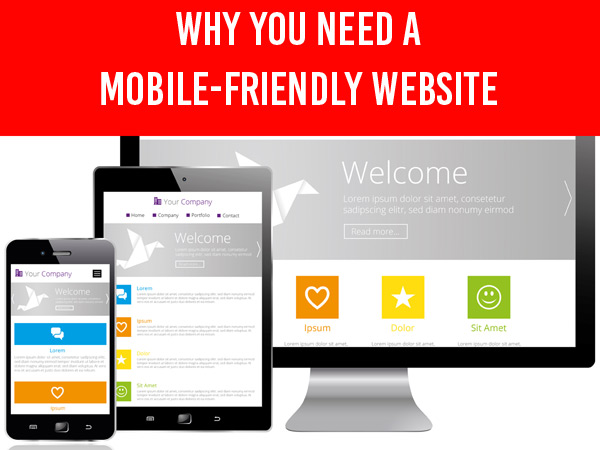
A mobile-friendly website is essential in this day and age.
We did a quick study and found that a large percentage (about 50%) of clients at Arnima Design still have older websites that are non-mobile device friendly.
We then checked outside their client base. We found that an even larger percentage (close to 65%) of websites were not mobile device friendly.
It is mid-2016 and the number of websites that are not mobile-friendly out there is actually quite surprising!
And here’s the kicker:
What we learned was that an astonishingly large number of people believe that they actually don’t need a mobile-friendly website!
Just to be clear, mobile devices include smart phones, tablets of all sizes and convertible laptops. By convertible laptops, we mean portable devices that can turn into tablets. Traditional laptops are portable but do not typically fall under the umbrella of mobile devices
Are You Losing Website Visitors?
Did you know that if your website is not mobile-friendly, you could be losing as many as 50-55% of ALL your website visitors?
Think about it.
Potential customers land on your website. Since your website is not mobile-friendly, all they see is a shrunk down or cut-off website.
Most of them will “bounce” (as in click the X to close the tab or browser window or go to a different website site or simply click the back arrow and go back to where they came from).
They do this because they don’t want to deal with pinching, zooming and scrolling to move around to find what they need on a website that is not mobile-friendly. They also don’t want to squint to read small text!
Remember, when mobile Internet users land on your URL, they expect a mobile-friendly website!
And if your website is not mobile device friendly, they are going to leave unless there are compelling reasons for them to stick around. Even with compelling reasons, they may still leave!
In fact, you are may be losing potential customers and you are probably not even aware of it.
The problem stems from not knowing how many potential customers you may be losing. And you won’t know this unless you track your website visitors and figure out a trend based on where they go and what they do once they get to your website. One way to tell is by looking at data captured by Google Analytics (or a similar tracking system such as StatCounter) and focusing on acquisition stats and user behavior on your website.
Global Statistics
Let us take a close look at this chart. Obtained from Statista, this chart shows the mobile phone internet user penetration worldwide from 2014 to 2019.

Find more statistics at Statista
You will see that as of 2015, the number of people using mobile devices to access the Internet is actually more than people using desktop computers or laptops!
Mobile device users have surpassed desktop & stationary computer users and it is anticipated that by 2017, close to 60% of Internet traffic is will be generated by mobile Internet users.
And if you do not have a mobile-friendly website you are not going to see this visitor traffic to your website.
Is this enough for you to sit-up and pay attention?
Google’s Stand
To that point, in April 2015, Google announced that they would potentially penalize the search rank of a website or web page that was not mobile-friendly. So it makes it even more important that your website is mobile device friendly. If you are interested, you can read that blog post here.
Mobile-Friendliness
So, what is mobile-friendliness all about? Let us start by looking at two websites that are not mobile-friendly.
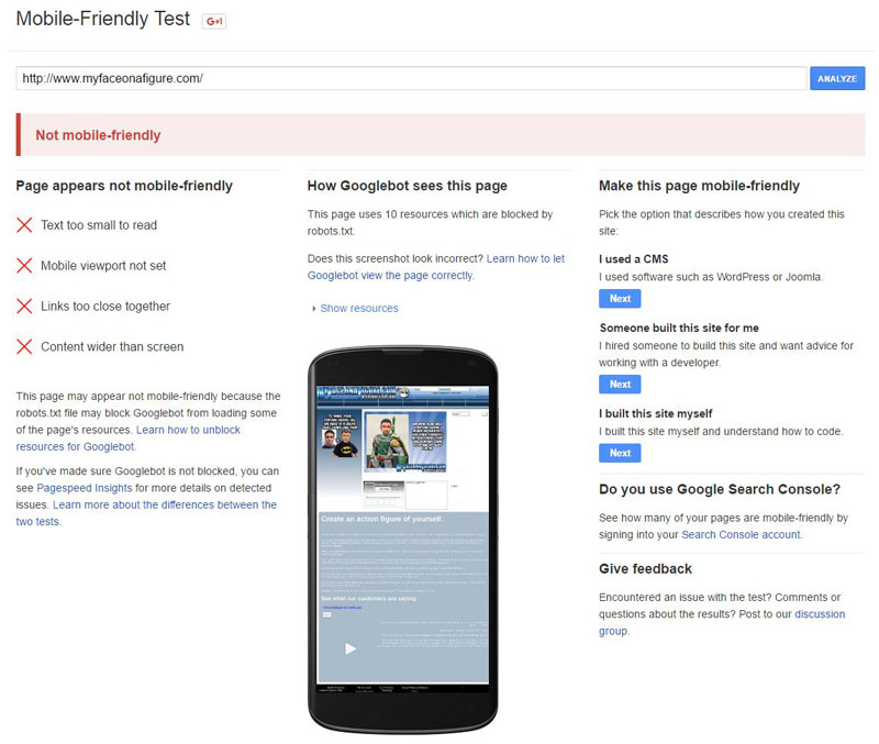
The first website, My Face on a Figure, was completed about 4 years ago. My Face on a Figure was (and still is) a unique offering in the world of toys! When viewed on a mobile device, specifically a smartphone, in this case, an iPhone 6s, you see the entire website scrunched down to fit the small mobile screen and it is very difficult to navigate and move around the website and find information:
When viewed on a mobile device, specifically a smartphone, in this case, an iPhone 6s, you see the entire website scrunched down to fit the small mobile screen and it is very difficult to navigate and move around the website and find information:

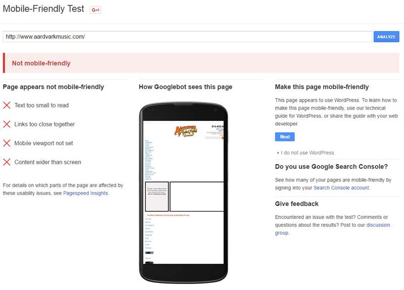
The second website, A Ardvark’s Music Rental Center in Tampa, Florida, was completed even earlier, about 5 years ago.
When viewed on the same device (iPhone 6s), it is also scrunched down to fit the screen and parts of it are cut-off on the right:

These websites are difficult to navigate and require a lot of panning, pinching, and zooming to view content.
Mobile Internet users are not a patient lot and, as such, not having a mobile-friendly design annoys them to the point that they just leave.
Next, let us look at a mobile-friendly website.
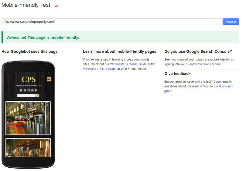
This is for one of our clients, Complete Property Services.
The original website was completed 4 years ago and it was made responsive in 2015.

See how the website shrinks to fit the device screen and notice the yellow menu icon that appears on the top right and can be used to open the menu.
Notice how the other links fit properly in the menu as well. As you scroll down, you can also see how various parts of the website stack on top of each other to create easy navigation.
This is what a responsive website typically looks like.
Next, let us look at a dedicated mobile website.
In this case, we are going to go to the NY Times Dedicated Mobile Website.

Notice that how this website is specifically for mobile devices appears as mobile device friendly, even in a desktop browser. And what’s more, even the dedicated mobile website is responsive such that it adjusts to the size of the screen of the device accessing it – whether a tab, or a phone.
Is Your Website Mobile-Friendly?
How do you find out if your website is mobile friendly?
Start by pulling up your website on a smartphone and see how it renders. If it is shrunk down to the point where you can barely read anything, or if it is cut off at the bottom, or on the right, well, you have a non-mobile-friendly website.
In addition to a simple check using your own smartphone, there are many tools available that will tell you if your website is mobile-friendly or not. Of these, one of our favorites is the Google Mobile-Friendly Test tool.
The Google Mobile-Friendly Test Tool
You can use the Google Mobile-Friendly Test to see if your website is mobile device friendly or not. All you need to do is to key in your website address and you will get the results in a couple of minutes. We ran the above 2 non-mobile-device friendly websites through the tool and we also ran the website for Complete Property Services through it as well.
Here is what the tool reports for the My Face On A Figure website that was scrunched to fit the small screen of the device:
And for Aardvark Music:
And finally, for Complete Property Services:
Having a mobile friendly website is actually very important to the success of your business on the Internet and it is high time that you seriously started to think about how mobile friendliness fits in with your overall web presence strategy.
Ask yourself if you really need a mobile-friendly website. If your answer is no, ask yourself again. In this day and age, your answer should only be a resounding yes! The only consideration should be whether your website should be made responsive, or whether you should get a dedicated mobile website.
Responsive Websites
Websites that are designed to fit smaller screens) have to take the following things into consideration:
Navigation

Mobile navigation should be easy. Most mobile websites have a dedicated menu icon that, when tapped, will open a menu with the top level pages.
Notice how the menu icon appears on a mobile-friendly website.
Most responsive website frameworks used to design & develop websites automatically take this into consideration. Some even allow you to customize the location and position of the menu icon. However you style the menu, just make sure that the icon is prominent, easy to identify.
And, unless you absolutely must, please you do not stuff all links inside the main menu icon.
Minimizing User Frustration
Let’s face it. People simply don’t like to pinch and zoom incessantly when navigating a website on a mobile device. So please take this into consideration as you work on your mobile website. Remember that almost everything is fully customizable when it comes to laying out your website components when making it responsive. It is best to structure is such that the most relevant information appears first followed by other items.
 Call to Action

Mobile users convert differently as compared to desktop based users.
Your phone number should be displayed prominently and should be easy to find without any hunting around. And be sure that the click-to-call feature his properly implemented and enabled. The click-to-call feature allows people to tap your phone number or a call us link to immediately place a call to you.
Look at the click-to-call feature as it appears on an iPhone 6s. The popup appears immediately after the phone number is tapped
In fact, a lot of mobile users prefer to use the click to call feature so they can simply click the link to place a call to you. On a desktop website, you may want desktop users to fill out a form, or a quote request or something similar and on a mobile website, you may want people to simply click to call. If you do want mobile users to fill out a form, keep the simple and easy to fill out and easy to find.
If you have invested time & effort into building a dedicated mobile app, you may want to place a call to action that directs people to download your app.
Performance Optimization
Mobile users especially expect fast performance, generally faster than desktop users. So, your mobile-friendly website should load quickly. Test the website using the various tools available and optimize it for performance for both desktop and mobile platforms. Generally, a score of 65-70 on Google’s Page Speed Insights is considered to be good for mobile-friendly websites.
Here’s look at the performance score of a typical well-designed mobile-friendly website, in this case, the website for Complete Property Services:
Read more about website optimization on my blog post about how to make your website load super fast.
Responsive or Dedicated
A responsive website is designed to automatically adapt to the screens size of the device that is being used to access it. By detecting the screen size, a responsive website will automatically render itself in such a way that it will fit the screen for best readability and user experience. A dedicated mobile website, on the other hand, is a separate website designed especially for mobile device users and runs concurrently alongside your desktop (or full-size) website.
There are situations where a dedicated mobile website is preferred over a responsive website. In fact, in many cases, it makes more sense. For example, the New York Times has different desktop and mobile websites. But, then, they are a media house that is continually updating content and for them it makes sense. For most of us, responsive sites are the way to go.
Social Sharing
Statistics show that mobile device users are 2-3 times more likely to share content on social platforms because they are “more” connected with their social profiles as compared to traditional desktop or stationary device users.
Mobile Device Usage
Looking at the above chart from Statista, you will notice that future trends predict that mobile usage will continue to increase, and to increase steadily. More and more people rely on their mobile devices, especially smartphones to conduct business, made day to day purchases, read reviews, read, watch movies, searches, social media, and pretty much anything and everything in between. So mobile users are going to become increasingly more and more important.
Mobile Apps
Mobile apps are on fire! In fact, apps are one of the fastest-growing segments in the mobile world. Depending on your business, a mobile app is a great way to build user engagement and keep users connected.
Mobile Marketing
Mobile marketing is a critical part of web presence, in fact, to the point where a lot of businesses are placing more emphasis on mobile marketing as compared to desktop/stationary marketing. The reason is simple – over 50% of the world’s internet users are now accessing mobile devices so it behooves you to give serious thought to making your website mobile device friendly.
Bandwidth
Mobile companies are investing very heavily in improving their infrastructure. AT&T is already working on 5G – the so-called fifth generation – of mobile services that promise to further revolutionize how we do things. The higher the bandwidth, the more users expect from websites so it makes sense to stay mobile-device focused.
Mobile Devices
Mobile devices are getting better, smarter, faster and more useful and mobile sales are predicted to rise steadily. Every mobile manufacturer is continually working on improving their offerings. Higher density screens – such as Apple’s Retina displays and the new 4K standard will push the envelope even more. Design and development technologies are continually evolving so it is imperative that you stay on top of the mobile gain. There is no getting away from mobile users!
Design Refresh
And if your website is older than 3 years, it is worth the cost and effort to refresh the design to bring it in line with current design trends. But that is another topic for another day (work in progress, so stay tuned).
If you don’t have a mobile-friendly website, don’t you think it is high time you got a mobile website?
